I’ve talked a whole lot about websites lately. They were the topic of the last session in the course I wrapped up in late August and I’ve been working on website audits for a handful of churches and organizations. When I start to have the same conversation with different people, I begin to think it might be worth sharing my nuggets of knowledge more widely. In other words, I’m giving you permission to eavesdrop:
The way we use a website relates to psychology, to how our brains work and why.
Our brain is in the business of conserving as much energy as possible. It looks for patterns and visual cues to know what may be important and what it can dismiss. This is why we don’t read websites; we browse them.
That’s worth repeating: people don’t read websites; they browse them.
It is for this reason that the presence of large, high-quality images that authentically represent your church and congregation are so very important. You see, it takes far less energy for our brain to process the relevance of an image than it does text. So we rely on images to tell us whether or not the written information on a website is worthy of an expense of energy. If your church website isn’t image-driven, you are not giving visitors any reason to linger, to investigate further, to read.
Often, when revamping their websites, churches spend an abundance of time working and reworking the text on their home and about pages, for example. But they never think to invest that much time and effort in the accompanying visual media. That’s a mistake.
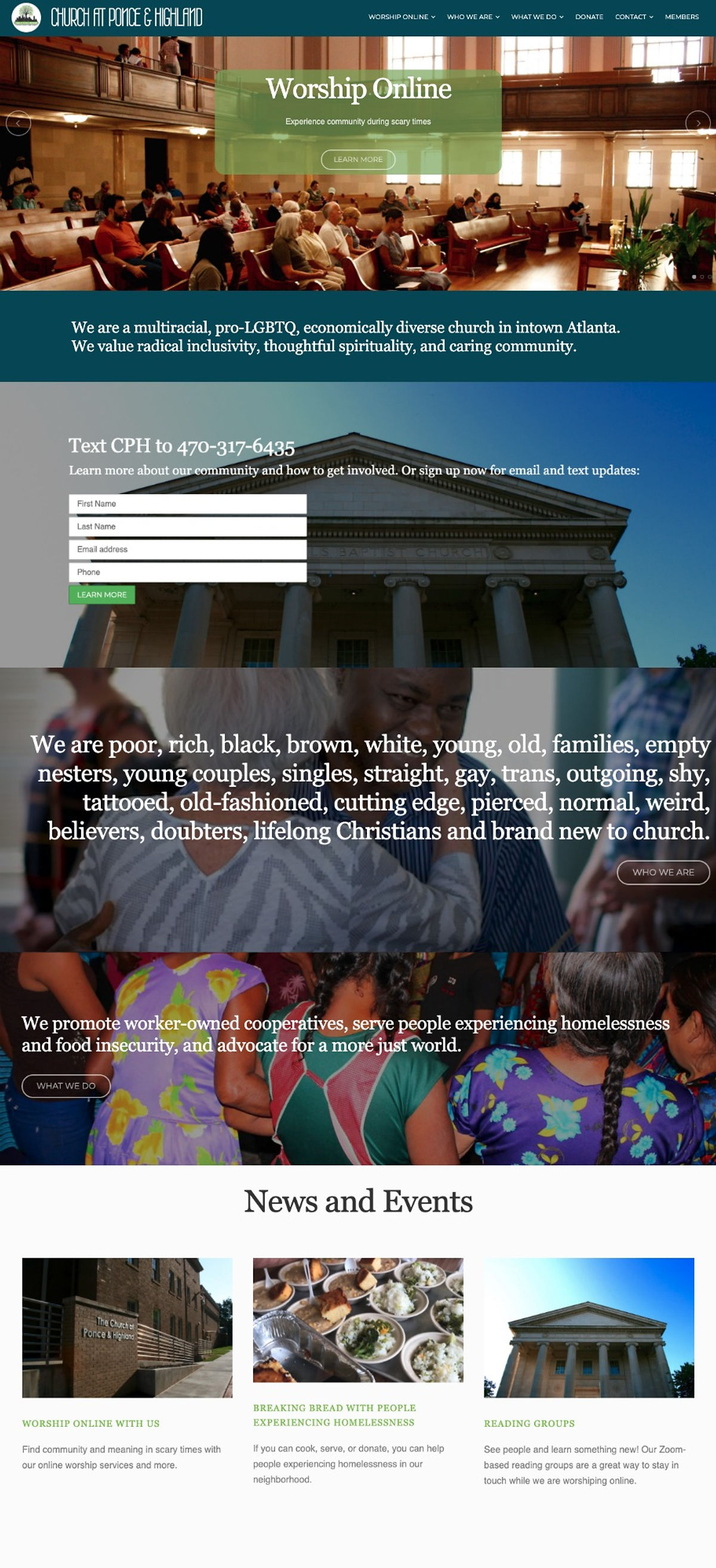
I offer the example below of the homepage my friends at the Church at Ponce & Highland have created. (This will be a good test to see if they read my emails and blog posts! 😂) For every section of their homepage, the text is minimal and is related to a strong and clarifying image that demands attention. Within seconds I have a solid understanding of who this church is and what they do and my brain can decide if it wants to dig around some more. If you don’t offer your website visitors visual cues for what you want them to know about your church, they won’t stick around long enough to read what you wrote.